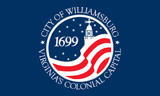
Flags are great backdrops for frathouse
selfies, but this Talk tells us that they’re the universal symbols of design, pride,
and sentimentality.
I think, going off of the blue, newer flag, that the design could be simplified even still.
This would be my proposed flag for Williamsburg.
1)
The red, white, and blue are obviously paying homage
to America. The city is so rooted in American history that one could not leave
it out of the flag
2)
The 7 stripes on the flag are paying homage to
the city itself. The city is a very religiously rooted city and the number 7
has a large meaning in many religions.
3)
The 13 stars represent the 13 colonies back in
colonial America. Seeing as Virginia was the home of the first permanent
colony, the star in the middle represents Virginia.
4)
The circular nature of the stars is paying
homage to the revolutionary flag that had the stripes as the American flag does
now but the stars were in a circle. Because Williamsburg is known as the
Revolutionary City, it is important to recognize the Revolutionary War on the
flag.


The blue square in the middle makes the flag look a little too much like a flag on top of another flag, which could make the whole flag seem less distinctive.
ReplyDeleteThe blue square in the middle makes the flag look a little too much like a flag on top of another flag, which could make the whole flag seem less distinctive.
ReplyDeleteThis comment has been removed by the author.
ReplyDeleteI agree with Mason. The flag also is similar to our country's flag which could make it less memorable and more confusable
ReplyDeleteI like how you used a funny and attention-grabbing introduction in your tweet statement. Also, I feel as though your flag is not a simple as the video suggested flags should be. But, the use of only three color makes it look less busy.
ReplyDeleteThe blue square's lines aren't lined up with the stripes which makes it look like an accident, and this flag is basically just the colonial US's flag with the blue square moved into the middle. It is not distinctive enough from the US flag.
ReplyDelete